Tuesday, 25 March 2014

Colouring in a Line Drawing on Photoshop Part 2

Our task today was to create a collage of images however, this collage was to be of our edited line drawing seen in the previous post.
As with the previous post, this is the beginning of the process. This is my original line drawing which has been scanned in and is ready to be coloured in. I repeated the process in the previous post do do this.  I set this document to a resolution of 150 pixels/inch.
This is the result of colouring in an is the first image to go onto our collage.


To start off the collage, I opened a new A3 document to which I also set to a resolution to 150 pixels/inch. This is so that the image isn't distorted on the new file.
I then used to move tool to drag my first image onto this new file.


The second image of our collage is an inverted image of the original. It is also dragged onto the new file using the move tool.
The third image of our collage is a desaturated image of the previous. It is also dragged onto the new file using the move tool.
The forth image of our collage is an inverted image of the previous. It is also dragged onto the new file using the move tool.

Final Image

Tuesday, 18 March 2014

Colouring in a Line Drawing on Photoshop

This task was pretty simple. We had to spend 20 minutes or so just drawing a simple line drawing of an object or multiple objects. I chose to draw a stack of books. We then had to scan in this image we had drew so we could edit it on photoshop and make it a colour image.

This was my line drawing. It was scanned in upside down so my first task was to rotate my image 180 degrees.

This is the result however, as it was evident in the previous image, the pencil had smudged and had cause it to look very unclean and I also had writing on the image. I used the rubber tool and magic wand to clean up my image but keep the stencil of my books. Once i had done this, I used the curves tool to make the lines darker and the white, whiter.

To add colour, I used the magic wand to remain within the lines in certain areas. Then, it was the simple task of using the paintbrush tool and colour to, like in an actual drawing, layer the colours to create a sense of light and shading.


I also used the blur tool, dodge tool and burn tool to help define or blend some areas.

Final Piece

Tuesday, 11 March 2014

Editing a painting on Photoshop


In this lesson, our task was to chose one of our images we had painted over the past week and edit it so that is resembles a final, mounted piece.

The first step was to rotate the image so that it was correctly placed and ready to edit.

Next, I cropped my image using the crop tool to A3 proportions [42x29.7cm]

Then, to help with editing the shading/brightness and contrast to my desired levels, I used the levels tool- which allows me to change all 3 of these so that my image looked as I desired.

I then went to image, adjustments and chose to mess around with hue/saturation. I could change the entire colour of my piece if  chose to but I decided to keep it realistic and see what i could do with the greens.

The last step was to as a boarder to my image so that it resembled a photography final piece where you would frame an image using black mount board. I did this by selecting 'canvas size' and choosing to add a black 100x100 boarder.

The Result

Tuesday, 25 February 2014

Editing an image in Photoshop

For this first part in photoshop editing, out task was to edit an iconic image, so that the final result almost represents a 'Roy Liechtenstein'/'Andy Warhol' style- using the techniques as followed.

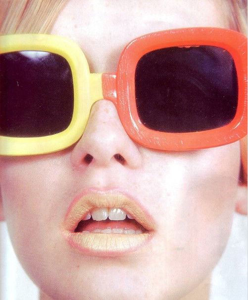
As if to almost keep with a 60s theme and style, I chose an image of Twiggy; a model who rose to fame during the 60s. I saved the image to my desktop and them opened it in photoshop where I could begin editing.

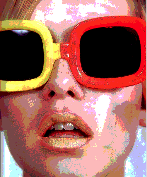
 The first step was to got to the image adjustments, where I did a bit of pre-editing and adjusted the contrast and levels to help later on in the process, where large, dark areas a required to create a successful final piece. I then selected the posterise tool which, as you can see above, increases the contrast and highlighted/low-lighted the darker and light areas of the photo [which is why pre-editing was necessary when the original image was over exposed]. I then selected the curve tool. By adjusting this, this also helped to emphasis the light and dark areas.

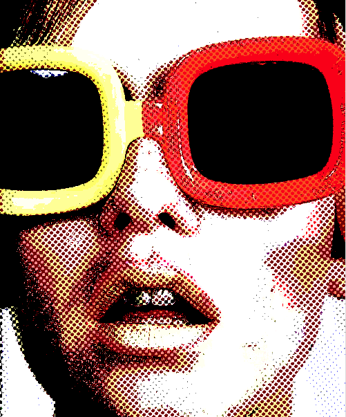
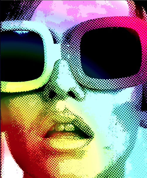
I then went onto 'mode' and selected 'greyscale' which converted the colour image into a now black and white one. Then, in 'mode' again, I selected 'bitmap'. With this tool, I could make my image look like it is formed out of dots [of any size placed at any angle]. The more dots selected, the finer they are but the more detail you have. I chose 12 dots at 40 degrees and the result can be seen above.
We then had to select the whole image, copy it and then skip back a few steps until the image presented on photoshop is the same as the one seen in the previous step. I them pasted the black and white image which is now a new layer. 
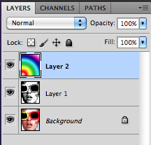
This new layer is now layer 1. I adjusted the opacity of layer 1 so that the white areas became transparent and the previous colour image is now visible in these areas while the black dots remain, creating further shadow in the desired dotted design.
I feel this image itself could be a final image but i wanted to carry on experimenting with new techniques.
I then inserted a new layer [layer 2] which I then used the colour gradient tool to place place a specific design on my image. I chose transparent rainbow- which fit with the  psychedelic 60s theme.
In the layers menu, i had to shift layer 1 above layer 2 so that, once a again, the black dots created shading in the desired design.
Like before, I edited the opacity of layer 2 so that it fit the image in the way i wanted.


Final Image

Tuesday, 4 February 2014

CINEMA 4D Perfume Bottle

For this session, our task was to model a perfume bottle in Cinema 4D using he 'akima spline' and 'lathe nurb' tools. 

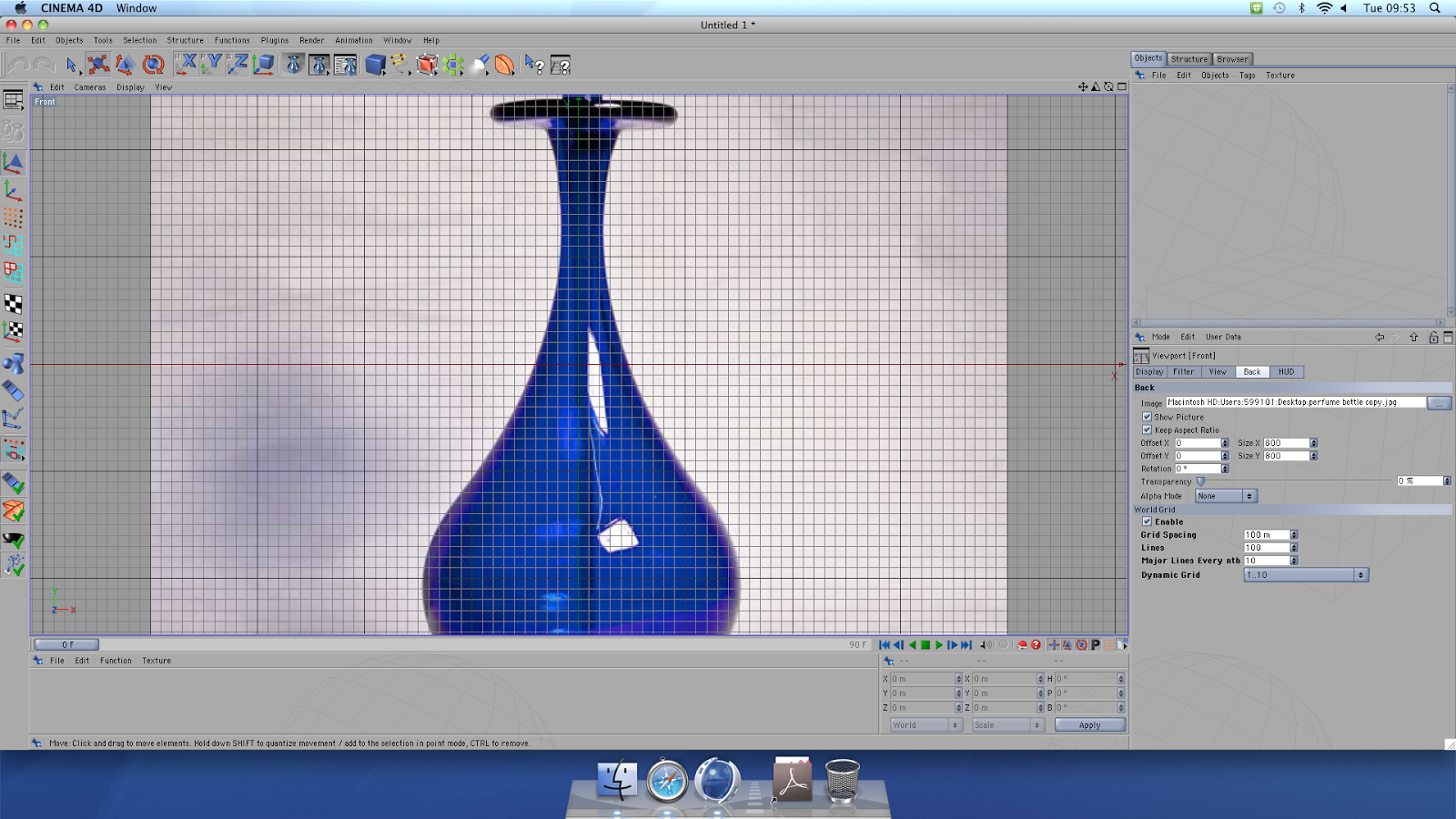
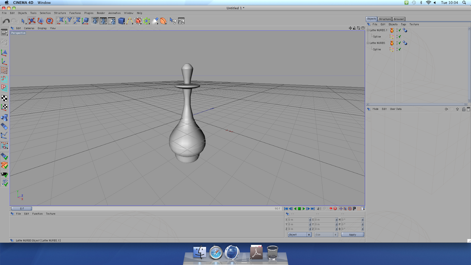
The first part of the task was to chose a perfume bottle image and upload it to the Cinema 4D program. This will be used as a template.

Then, we selected the 'akima spline' tool to the use to plot the outline of out perfume bottle- starting at the top of the bottle, at the troat/opening. Then, selecting the 'move tool', we held down the ctrl key while plotting only the right side of our perfume bottle template.
When we have reached the centre of the base of the perfume bottle, we then worked back on ourselves; plotting more points just to the left inside of the points we have just created. The gaps between the plotted points determine the thickness of the perfume bottles glass body.


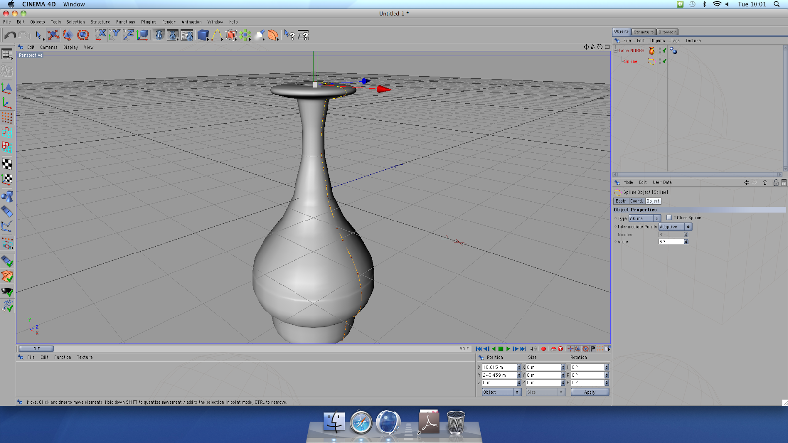
We then switched to the perspective view.  Then, going to the Nurbs object menu, we selected the 'lathe nurb' tool. This action becomes visible in the Object manager. Within the object manager, we selected our spline tool the pathway of points we had plotted) and moved it onto the 'lathe nurb'. The Lathe Nurb converts the 2D path we have plotted into a 3D form. 

We repeated the process of plotting points on the template image and using the 'lathe nurb' tool to create a 3D image on the perfume bottle lid. The perfume bottle and its lid were done in 2 different actions as, in reality, the two are  separate objects.  

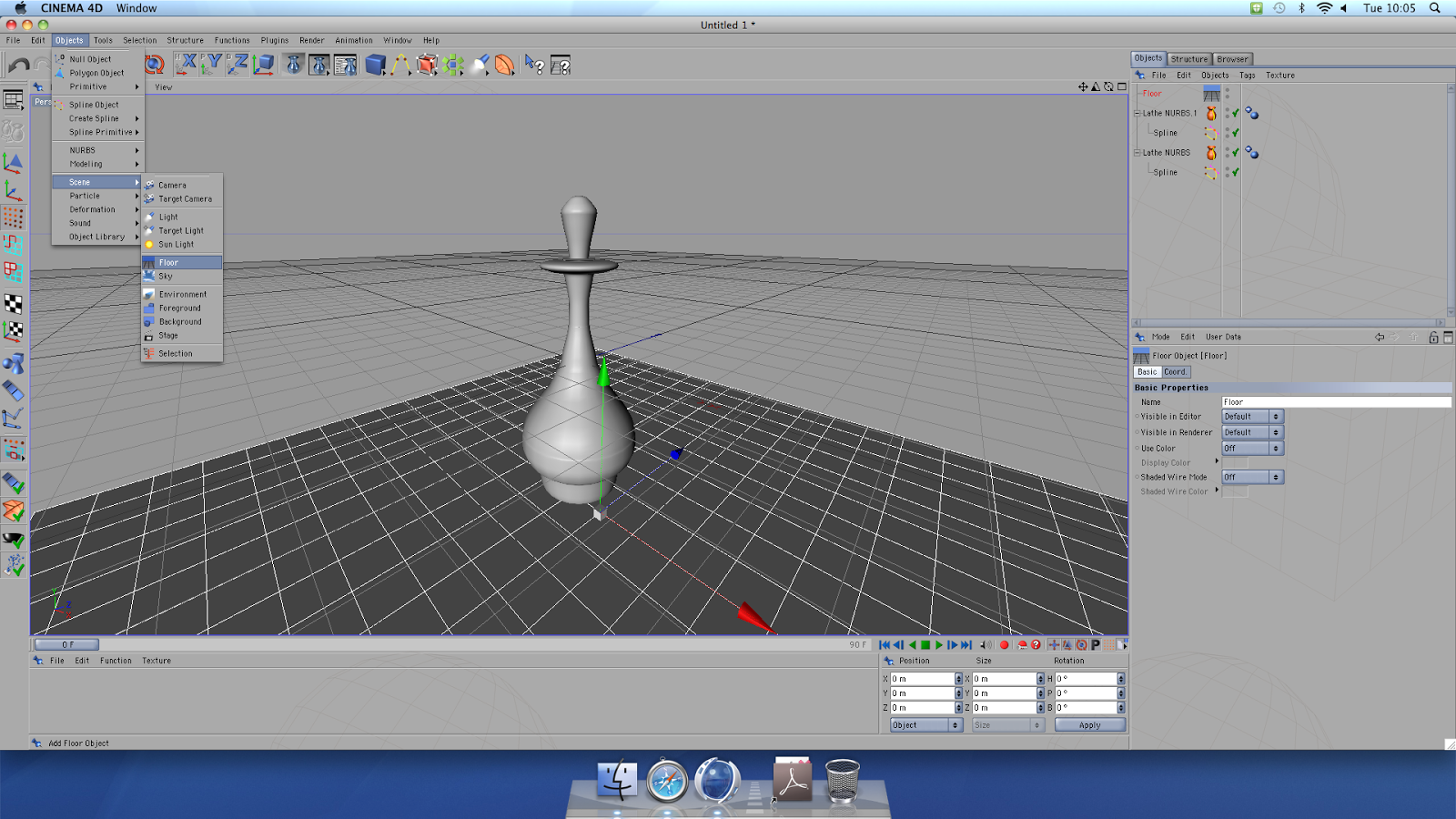
Then, by going into the Object menu, we selected scene, which then allowed us to add a floor object to our perfume bottle scenario.
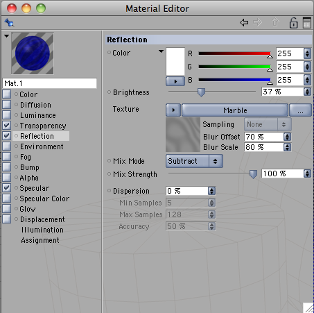
Then, we had to create a material to apply to the perfume bottle and to the floor. This image shows the material used for the glass perfume bottle. We could edit the colour, texture, brightness and reflection all to create our desired outcome. 

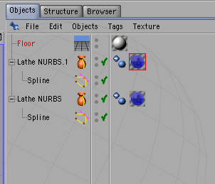
You then had to drag and drop the desired materials to their object in the Object Manager.
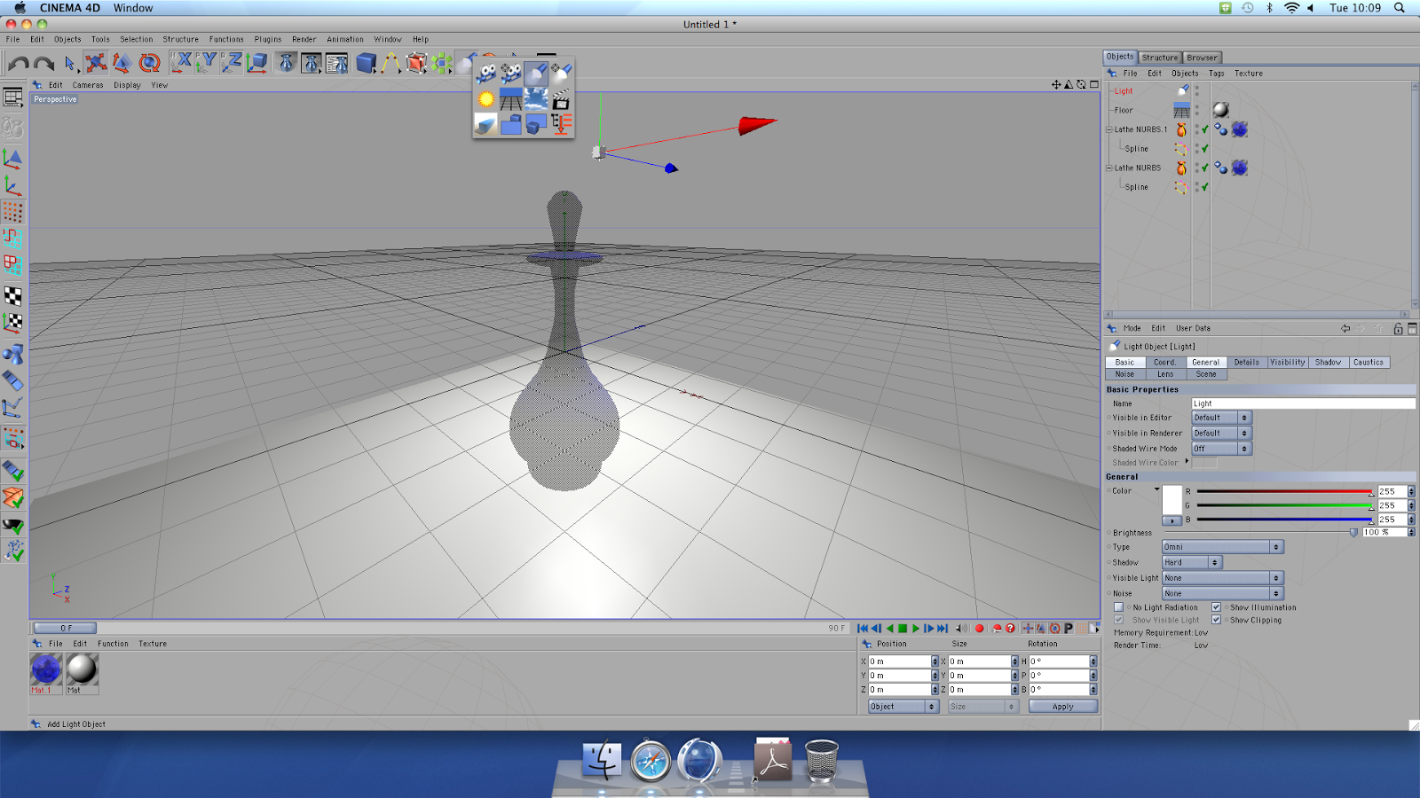
In this image, 'Lathe NUBRIS' and 'Lathe NUBRS.1' are the perfume bottle and its lid. I made my entire bottle a blue glass with a smooth, marble texture. 

Our last task was to add light to our scene. to illuminate our objects.  After selecting the light tool, you are able to manipulate its position, height and angle to create your desired reflection and shadows and to have your final perfume bottle design presented in the best way possible.


Final Image

Tuesday, 7 January 2014

Using CINEMA 4D

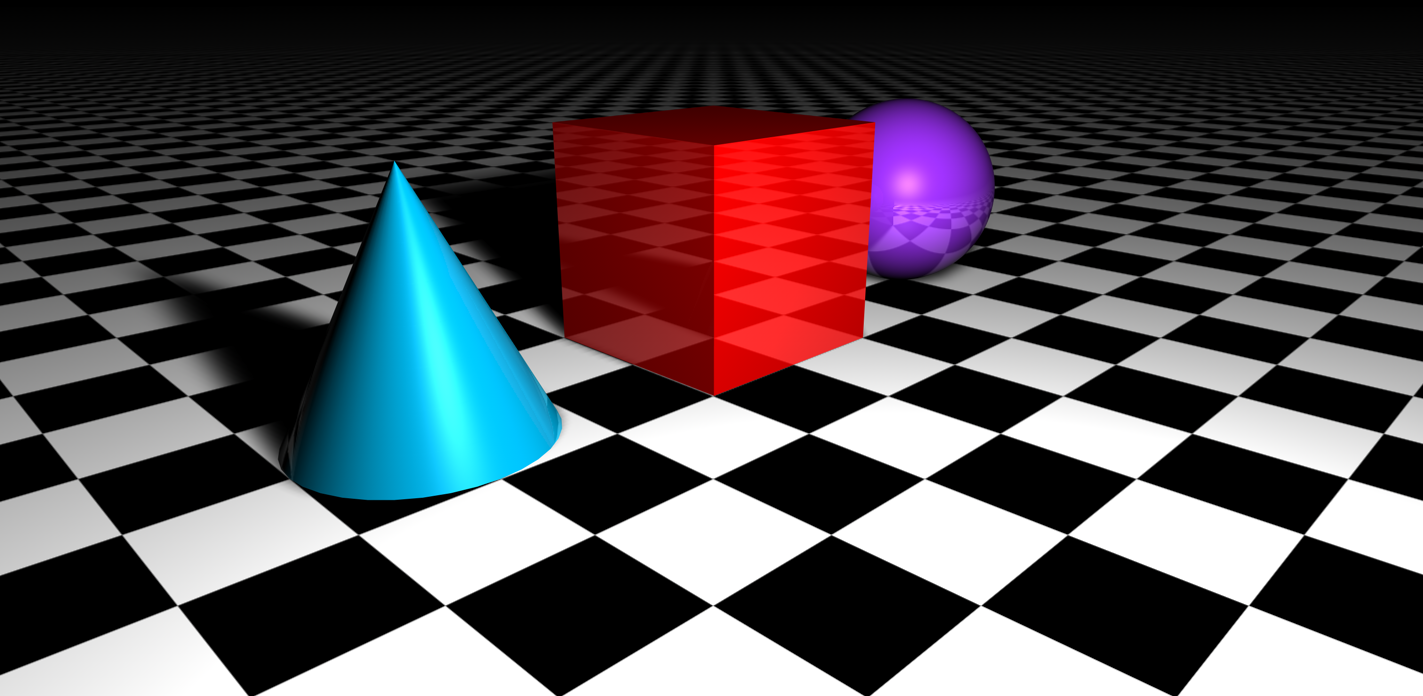
For todays lesson, we were introduced to basic Cinema 4D concepts and techniques. Our goal was to create 3 objects and change their colour, reflection and the light source all to end up with a image that resembles something of a realistic nature.
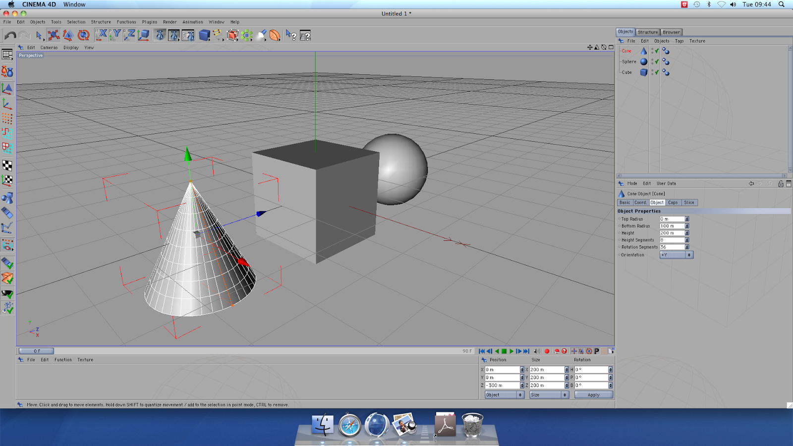

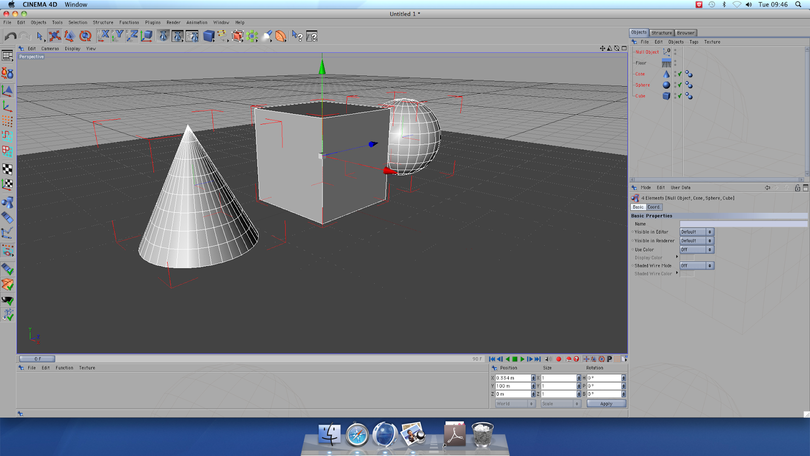
Our first steps were to add a cube, sphere and cone shape using the shape menu into the scene. Each shape was automatically entered at a '0' XYZ coordinate. I changed the sphere to 300m along the X axis and the cone to -300m so that they were all visible and positioned in a line. 

Then, to the scene, we added a floor. However, when doing this, the newly added floor had engulfed have of each object so, after selecting each object, we then had to edit the Y axis coordinate to 100m- this enabled each object to be fully visible once again.

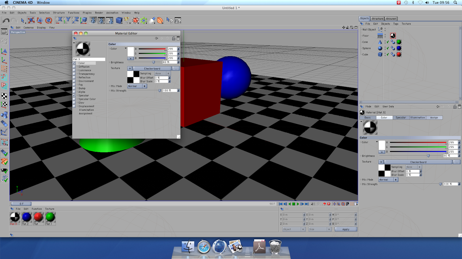
We then moved on to changing the colour and reflection of the surfaces of each object and the floor. To do this, we went to the Materials Manager and selected 'New Material'. Then, by selecting 'Colour', we were able to adjust the red/green/blue ratios to create a colour. Then, by selecting 'Reflection', we edited the amount of desired reflection to 20%; the end result shows how this has an affect on the image. You repeated this 3 times, each time dragging and placing the personalised setting to your chosen object.

The same applies to the floor however, the only slight difference is: when selecting ''Colour', we then selected the 'Texture' tool to change the surface to a checked surface. We then repeated reflection and this setting was then dragged to the floor icon.

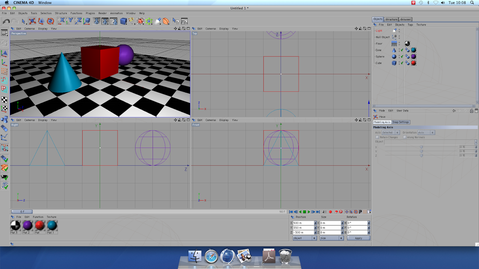
We then moved on to lighting in our scene. By adding an Omni Light object, you instantly created a light source. We adjusted the coordinates of the light so that it was more visible within the frame and also created shadows and reflection that would be seen in the final result. 

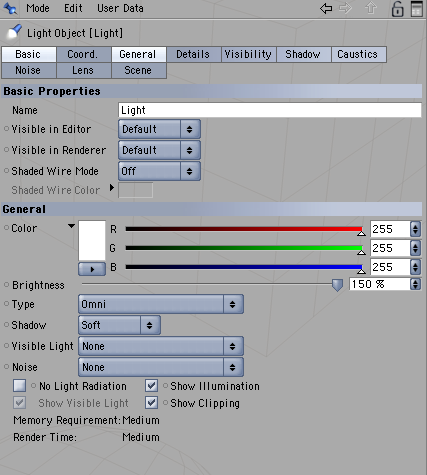
We decided to adjust the brightness to 150% and, in the manager, selected 'Soft Shadow'. This will really make the shadow and reflective attributes more visible in the final result. 

The final Result

Tuesday, 26 November 2013

Creating a Tag

To begin this lesson, we had to decide on a wall background on Google we could download and then use for our final piece. We then opened a Photoshop document and create a custom size background and added a new layer.  We selected the calligraphic brush tool [a brush that is designed on an angle] to design a funky tag as seen above. I did my name.
After creating the tag, I selected the FX tool>stroke and began to personalise our tags by selecting options such as Outer glow, Inner Glow, Gradient overlay, Inner shadow etc. to change the colour and the gradient of the colour within and surrounding your design and the shadows/glow. We then flattened the image so it was all one layer, selected it and copied and pasted on our downloaded wall background.


Once the image is pasted, I selected the layer mode to 'multiply' so that the white background disappeared and i was only left with the design of my tag upon the wall background. I realised the wall background was at a slight angle and decided to use Free Transform>Distort to mess with my tag until it fit and looked natural. I then also decided to use a filter to see if I could make my piece more original; I decided to use the filter Paint Daubs as it gave it an interesting glowing outline.

The Final Piece.